
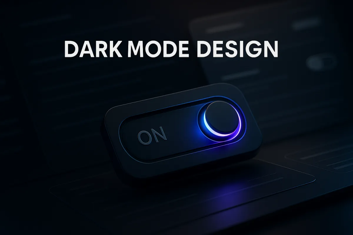
Implementing dark‑mode design to cater to user preferences
Introduction
The shift toward personalization in digital experiences has never been more prominent, and one of the clearest user-centric preferences today is dark mode design. As of 2025, over 80% of users report that they prefer applications and websites that offer a dark mode option, citing benefits like reduced eye strain, improved battery efficiency, and aesthetic appeal.
But dark mode is much more than a passing trend. It has evolved into a must-have feature for apps, websites, digital products, and even email communications. From enhancing visibility in low-light environments to aligning better with modern UI/UX design trends, implementing dark-mode experiences can significantly influence user satisfaction and engagement.
In this comprehensive guide, you’ll learn everything you need to know about implementing dark mode to meet user expectations while maintaining brand integrity, accessibility, and technical reliability. Whether you're a business owner, marketer, or developer, this article offers practical advice and technical recommendations that can help improve user retention and brand appeal in today’s competitive digital landscape.
What you’ll learn:
The fundamentals and evolution of dark mode
Why your business needs dark mode in 2025
Effective strategies to implement dark mode
Common design mistakes to avoid
Practical steps to get started
Frequently asked questions
Understanding the Concept: Definition and Key Concepts
Dark mode is a user interface design style that uses dark-colored backgrounds, typically dark gray or black, with light-colored elements such as text or icons. Originally favored by developers and power users, this UI option has gone mainstream, with global platforms like Apple, Google, and Microsoft making it native across their operating systems and applications.
Beyond the visual appeal, dark mode serves functional purposes:
Reduces eye fatigue during extended screen use
Saves battery on OLED and AMOLED screens
Supports low-light usability
Provides an immersive user experience
Historically, early computing environments used dark backgrounds by default due to technical limitations. Over time, the industry shifted toward light mode for readability, but as screen time has dramatically increased and design platforms became more versatile, demand for customizable viewing modes resurged.
For example, popular applications such as YouTube, Twitter (now X), and Slack reported increased session durations and user satisfaction after releasing dark-mode interfaces. E-commerce brands have also begun incorporating dark themes into seasonal campaigns and user personalization strategies, further validating dark mode’s market value.
Why Dark Mode Matters for Today’s Businesses
Dark mode is no longer just a tech novelty; it’s a user expectation. The ability to adapt your digital presence to users' preferences signals brand empathy, technical innovation, and respect for user comfort.
Enhanced User Experience = Higher Retention
People are spending more time on digital devices than ever before. Providing a dark mode option promotes a user-friendly experience that keeps them on your platform longer. Less eye strain translates into better focus and comfort, which encourages extended sessions, especially relevant for content-intensive apps like reading platforms, e-commerce, and finance apps.
Battery Optimization = Eco-Friendly Alignment
Dark mode can reduce power usage by up to 63% on OLED screens. This not only extends battery life for mobile users but also aligns your business with sustainable digital best practices and performance, an increasingly important trait for environmentally conscious users.
Brand Differentiation in a Crowded Market
Offering a high-quality, well-designed dark mode gives your business a competitive edge. Many smaller businesses simply toggle CSS values, resulting in poor color contrast or unreadable content. By contrast, a brand that carefully curates its dark mode experience demonstrates attention to usability and design sophistication.
Positive Impact on Accessibility and Inclusivity
Following WCAG accessibility standards, dark mode helps users with light sensitivity, visual impairments, or certain cognitive conditions interact with your site more comfortably. Offering both light and dark modes ensures your digital product is inclusive.
Accessibility and inclusive design also improve your SEO and user retention, which fosters brand loyalty and higher organic ranking.
Effective Strategies to Master Dark-Mode Design
Strategic implementation is key to successful dark mode adoption. Below are actionable steps and recommended tools that will help businesses roll out functional and aesthetically pleasing dark-mode experiences.
Step 1 – Conduct User Research and Audit Your Current UI
Before redesigning your digital interfaces, understand how your users interact with your product. Use tools like Google Analytics and Google Search Console to analyze behavior and identify high-impact areas. Consider deploying surveys or usability tests from platforms integrated with your project management tools like Notion or ClickUp to gather feedback.
Step 2 – Design with Purpose Using the Right Contrast and Colors
Use soft blacks (#121212) or dark grays instead of pure black for a more comfortable visual presentation.
Maintain at least a 4.5:1 contrast ratio for text over background. Use Google Lighthouse or other accessibility tools to test your color palette.
Avoid bright, saturated colors. Opt for muted tones and let your brand accent color shine through sparingly.
Step 3 – Define Brand-Consistent Themes
Avoid identity confusion between light and dark modes by carrying brand colors into both themes consistently. Develop design systems and component libraries in tools like Go HighLevel (GHL) or use design tokens that easily switch between light and dark variables.
Step 4 – Implement and Test the User Toggle
Give users control to switch modes easily. You can offer a toggle in your app navigation, account settings, or via device or OS defaults using CSS Media Queries (prefers-color-scheme). Sync with user preferences stored in your CRM system for persistent experiences.
Step 5 – Test Visual Media and Media Assets
Dark-mode design extends beyond text. Optimize your images, SVGs, and videos with overlays or adjusted brightness and contrast. Avoid white halos, transparent PNGs, or washed-out assets. Consider dual graphic sets if necessary.
Step 6 – Cross-Platform and Email Compatibility Checks
Different platforms interpret dark mode differently. Test across:
Desktop browsers (Chrome, Safari, Firefox)
Mobile devices (iOS, Android)
Email clients (Gmail, Outlook, Apple Mail)
Ensure consistency using modern content management systems that support dark-mode-friendly templates.
Common Mistakes Businesses Should Avoid
Using Pure Black (#000000) as the Background
While it may seem intuitive, pure black can cause glare and discomfort. More importantly, it makes transitions between colors and visuals harsh. Prefer dark shades like #121212 or #1E1E1E for smoother presentation.
Not Considering Accessibility Standards
Many businesses overlook color contrast, making buttons and text unreadable. Following WCAG Level AA standards helps avoid these issues. Additionally, run A/B tests for users with different vision abilities. For developers not prioritizing inclusivity, these costly web design mistakes could weaken user engagement.
Ignoring Iconography and Visual Cues
Icons, illustrations, and logos often disappear on dark backgrounds if not designed correctly. High-contrast assets and vector customization are essential.
Generic One-Size-Fits-All Implementation
Each app or website has unique user demographics. Blindly applying a dark theme across all pages can lead to inconsistent experiences and abandoned sessions. Prioritize key screens first, such as login flows or dashboards, before expanding.
Getting Started: Practical Steps for Implementation
If you're ready to implement a dark mode strategy that aligns with business goals, here’s how to begin:
Step 1 – Audit Existing Design Assets
Use project management tools like ClickUp to inventory UI elements, images, icons, and component behaviors across your current design.
Step 2 – Define Color Themes and Components
Develop dark mode variants for typography, backgrounds, icons, and UI elements. Namecheap's DNS tools can help you create staging environments securely, while Go HighLevel allows you to test variations with users in real time.
Step 3 – Implement Responsive Toggles
Integrate toggles that mirror system-level settings or offer app-level preferences. Store user settings persistently using your CRM platform or custom cookies.
Step 4 – Test in Real-World Conditions
Validate your dark mode interface under various lighting conditions and devices using QA checklists in Notion or ClickUp dashboards.
Step 5 – Launch and Collect Feedback
Roll out features incrementally and encourage user feedback. Use forms or surveys embedded through GHL and optimize them using best contact form practices.
Frequently Asked Questions
Does using dark mode improve SEO?
Not directly. However, a better user experience, particularly for readability and engagement, can reduce bounce rates and increase time on site, which are positive ranking signals for SEO.
Can I use dark mode just for emails?
Yes, you can and should. Many users now read emails in dark-themed email clients. Design assets, especially logos and banners, should be tested for dark backgrounds to ensure clarity and legibility.
Is it expensive to implement dark mode?
The costs depend on your existing framework and technical setup. For example, websites or apps built with modern platforms like Go HighLevel (GHL), Webflow, or WordPress with modular CSS variables can add dark mode efficiently, often without a full redesign. GHL users, in particular, can create dual color systems using custom theme variables, ensuring dark and light mode options align perfectly with brand standards.
For larger web applications or enterprise systems, costs vary depending on the complexity of your UI components, iconography, and user preference storage logic. However, the ROI on user retention, engagement, and accessibility makes dark mode one of the most cost-effective UX enhancements available in 2025.
Final Thoughts: The Future of Dark Mode Design
Dark mode isn’t just a design trend; it’s part of the broader personalization movement defining digital experiences in 2025. As AI-driven systems, CRM platforms, and user-centric tools like Go HighLevel evolve, adaptability and comfort are now at the heart of good design.
Businesses that implement dark mode not only show they understand modern user expectations, but also signal commitment to inclusivity, sustainability, and performance. Whether you’re an independent creator, digital agency, or enterprise brand, dark mode can strengthen your visual identity and make every interaction more intuitive.
The key takeaway: Dark mode is no longer optional; it’s an expectation. If you haven’t already integrated it, now’s the time to start planning. Begin with small, testable implementations and expand based on user feedback. Done well, it’s a design investment that enhances both brand trust and digital usability.
Quick Recap
Here’s what we covered:
The rise of dark mode as a user expectation, not just a style choice
Why it matters in 2025, from UX and accessibility to sustainability
How to implement it effectively, including color theory, toggles, and testing
Common pitfalls to avoid during rollout
Actionable steps to start integrating dark mode in your design system
Ready to Implement Dark Mode for Your Brand?
If your business runs on Go HighLevel or you manage multiple client sites, implementing dark mode across templates can instantly elevate your professional image. Ozlon helps brands build beautiful, high-performance websites with light and dark theme support, CRM integration, and automation-ready design systems.
Book a free strategy call today to learn how to implement dark mode and UX personalization seamlessly into your brand’s digital ecosystem.
