
Minimalist design vs. bold visuals: which fits your brand?
Introduction: Are You Speaking the Right Visual Language?
In today’s digital-first world, your brand’s success often hinges on a single impression. According to research, 94% of first impressions are design-related. That means your choice of visual identity, whether minimalist or bold, can make or break your connection with a potential customer.
But here’s the real question: Which design strategy truly aligns with your brand's mission, message, and market? Should you embrace sleek simplicity with minimalist design, or electrify your audience through dynamic, maximalist visuals?
In this comprehensive guide, we’ll decode the core principles, dive into current trends, weigh the pros and cons, and help you choose (or strategically blend) the visual style that not only differentiates your brand but deeply resonates with your target market. Whether you’re an entrepreneur crafting a new brand, a marketer rebranding a legacy business, or a creative director seeking design clarity, you’ll find actionable, step-by-step insights to build a brand identity that performs.
Understanding the Concept: What Is Minimalist Design? What Are Bold Visuals?
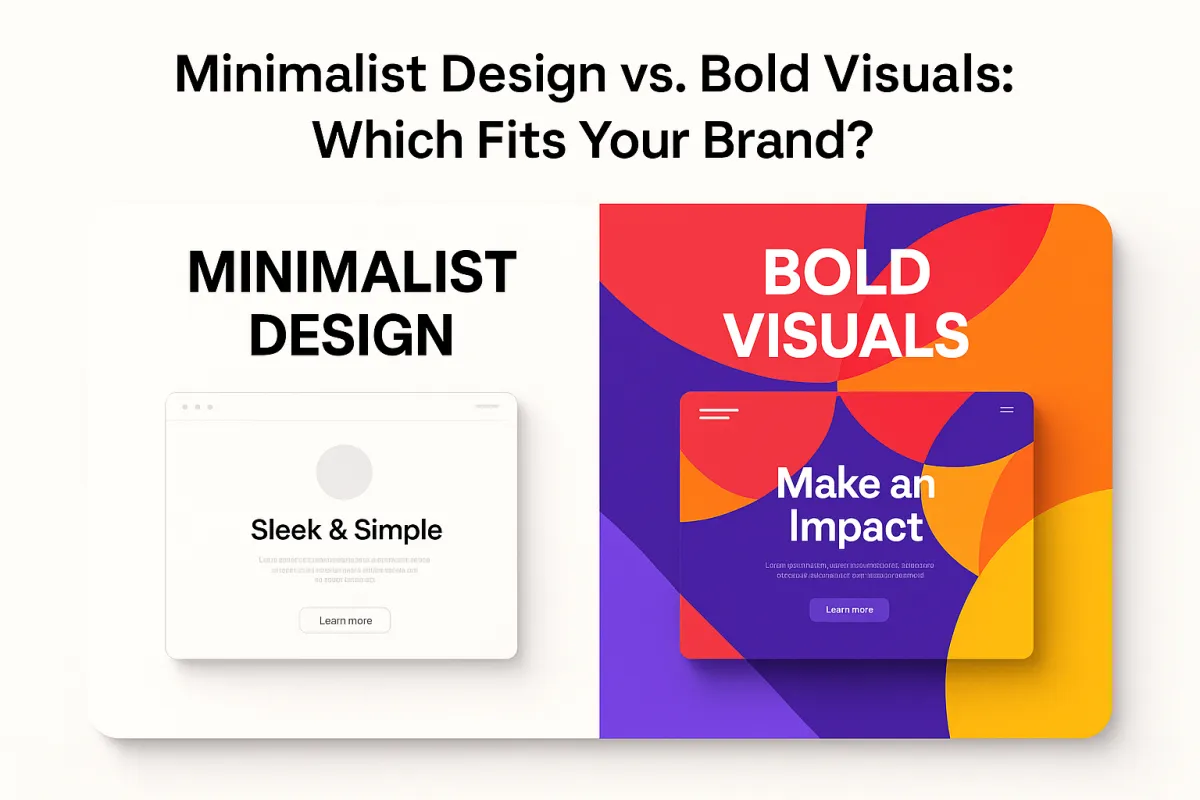
Minimalist Design: Simplicity with a Purpose
Minimalist design is a visual branding style rooted in clarity, function, and elegance. Originating from the Bauhaus movement and Scandinavian design principles, minimalism has evolved into a gold standard for modern, discerning brands looking to exude professionalism and longevity.
Think of Apple. Their use of white space, soft grayscale palettes, and intuitive interfaces make their brand synonymous with quality and exclusivity.
Key Characteristics
Clean, sans-serif typography
Limited color palettes (often monochrome or neutral)
Ample white space for focus and balance
Simple, iconic logos
Function over decoration
Minimalism strips away clutter so only the most essential elements remain, each aspect designed to elevate usability and brand clarity.
Bold Visuals: Making a Statement
Contrasting minimalism, bold visuals or maximalist design throw subtlety to the wind. Loud, layered, and full of energy, this style seeks to create an immediate emotional connection. Think of brands like MTV, Glossier, or Nike’s youth-focused campaigns where punchy colors, eye-catching fonts, and movement-heavy visuals dominate.
Bold doesn’t mean chaotic when done right; it’s strategic disruption in action.
Key Characteristics
Vivid, high-contrast color palettes
Bold typography with unique styles and heavy weights
Layered graphics and collage effects
Emotionally charged and culturally resonant visuals
Interactive or animated digital assets
Why It Matters for Today’s Businesses
Design isn’t just decoration; it’s your brand speaking visually. In a saturated marketplace, visual storytelling separates memorable brands from forgettable ones.
According to a 2023 Adobe survey, over 70% of Gen Z consumers say design influences their purchasing decisions. From social media to websites, packaging to branding, consistency in your visual language builds trust, emotional connection, and community.
For companies focused on refining their site experiences, website speed optimization and website security also play vital roles in amplifying design effectiveness, regardless of visual style.
The Risk of the “Sea of Sameness”
With many brands opting for safe, flat minimalist logos over the past decade (a trend dubbed “blanding”), a growing number of consumers now struggle to distinguish between competitors. This design fatigue has opened the door for bolder visuals that energize and personalize the customer experience.
Combining timeless minimalism with expressive boldness is now emerging as the secret to brand distinction in competitive industries.
Real-World Impact and Market Data
SaaS: Minimalist design correlates with quicker onboarding and higher usability scores among users.
Fashion & E-Commerce: Brands using bold visuals often observe higher engagement metrics, especially on visual platforms like Instagram and TikTok.
DTC Brands (Direct-to-Consumer): A hybrid approach using minimalist product packaging with bold digital campaigns has led to higher brand recall and customer loyalty.
Effective Strategies to Master the Concept
Whether you're leaning minimalist or going bold, a smart visual identity needs a strategic foundation. Here’s a step-by-step approach to mastering your brand’s visual language.
Step 1 - Conduct Audience Research
Use platforms like Google Analytics and Google Business Profile alongside your website to analyze current customer behavior and demographics. Find out:
What platforms do they use?
What visual styles do they engage with most?
Do they appreciate elegance or excitement?
Step 2 - Clarify Core Brand Values
Your visual style should reflect your mission and personality. Use Notion or ClickUp to map out brand values like:
Innovation
Trust
Community
Creativity
Simplicity
Align each value with a visual style. Creativity and excitement? Go bold. Trust and efficiency? Choose minimalism.
Step 3 - Audit Existing Brand Assets
Evaluate your current assets including logos, websites, social media, and packaging using tools like Go HighLevel. Is there consistency? Does it align with your audience and values?
Step 4 - Design, Test, and Iterate
Whether you're choosing a minimal look or bold flair:
Use Namecheap for clear, on-brand domain names
Design landing pages or mockups with Go HighLevel’s drag-and-drop website builder
Use Cloudflare to ensure web assets perform securely and quickly
Gather feedback via user test groups or email segmentation
A/B test variations and monitor metrics like bounce rate, time-on-page, and click-through rate.
Step 5 - Scale Strategically
Use Notion or ClickUp to manage brand campaigns, ensuring visual direction scales across:
Email campaigns
Website updates
Social content
Video ads
Common Mistakes Businesses Should Avoid
Mistake #1 - Copying Trends Without Strategy
Many brands adopt trendy minimalist logos or maximalist animations without thinking long-term. This leads to lack of identity and inconsistency.
Solution: Always start with brand values and audience preferences before executing.
Mistake #2 - Inconsistency Across Platforms
A minimalist website with a bold and colorful Instagram account sends mixed signals. This diminishes credibility.
Solution: Use design systems and brand kits managed in Notion or ClickUp to standardize visuals.
Mistake #3 - Ignoring Accessibility
Over-designed, layered visuals or pure white minimalist layouts can hurt readability.
Solution: Use accessibility tools built into platforms like Go HighLevel to ensure visual contrast and readability meet standards.
Getting Started: Practical Steps to Implement Your Brand’s Visual Identity
Step 1 - Define Your Persona
Use customer journey maps in Notion or CRM data from Go HighLevel to build brand personas. Identify what attracts, engages, and converts them.
Step 2 - Choose Base Colors, Logo Style, and Typography
Minimalist Design:
Use one to two soft or neutral tones
Pick sleek, sans-serif fonts
Simple wordmark or emblem logo
Bold Visuals:
Use contrasting or multi-tone vibrant palettes
Integrate custom or dramatic typefaces
Complex or layered logos
Step 3 - Create Brand Kits in One Platform
Centralize assets with Go HighLevel’s workspace suite. Store logos, templates, fonts, and styles for team cohesion. Utilize a content management system to streamline updates and visual rollouts.
Step 4 - Launch in Controlled Channels
Start with a landing page or product packaging. Measure reaction. Optimize. Then expand to campaigns and broader channels.
Frequently Asked Questions
Q: Should my startup use bold visuals?
A: Yes, if your target market values creativity, innovation, or disruption. Bold visuals help you break through early attention barriers.
Q: Are minimalist designs better for SEO?
A: Indirectly, yes. Minimalist designs improve page speed, structure, and accessibility, all contributing to higher SEO performance.
Q: Can I blend both styles?
A: Absolutely. A hybrid approach using minimalist structure with bold focal points can create the perfect balance of clarity and impact.
Conclusion: Finding Your Brand’s Visual Voice
Your brand doesn’t have to pick sides. The most powerful identities strike harmony between simplicity and expression. Whether you choose minimalist precision, bold creativity, or a fusion of both, your visual strategy should feel intentional and authentic.
Design is not decoration. It’s communication. And when your design speaks the language of your audience, everything else follows.
Want to explore how design affects conversions and credibility?
Read the full guide at https://ozlon.net/the-marketing-blog
