
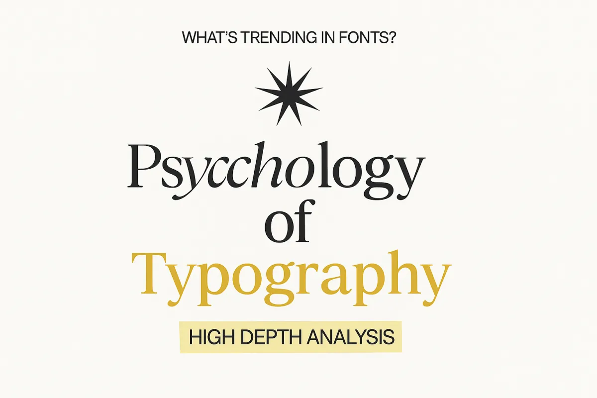
The psychology of typography and how fonts affect perception
Introduction
Imagine reading a legal contract typed in Comic Sans or seeing a luxury fashion brand logo written in Brush Script. Chances are, your brain would instantly raise an eyebrow—even before you've read a single word. This instant reaction underscores the silent yet powerful role typography plays in shaping perception. Whether you're launching a brand, crafting marketing campaigns, or designing a website, font selection can greatly influence how your audience feels and reacts.
In today's saturated digital market, where attention spans are shorter than ever, the subtleties of design—especially typography—can make or break your message. This article explores the compelling psychology behind fonts and typography, showing how they influence perception, trust, memory retention, and ultimately, decision-making.
By the time you’re done reading, you’ll understand the fundamental principles of font psychology, its practical applications across industries, and how to use typography to reinforce your brand's personality and communicate more effectively.
Understanding the Concept: Definition and Key Concepts
Typography psychology, or font psychology, is the study of how different typefaces impact human cognition and emotional response. It explores how people subconsciously interpret fonts, associating them with trustworthiness, professionalism, creativity, or other qualities—often before they process the actual content. In short, the font you use starts communicating long before your words do.
Rooted in cognitive science and semiotics, typography psychology has evolved since the printing revolution and has become central to advertising and digital design. Modern research confirms what designers have long known: the typeface you choose can alter readability, influence recall, create emotional resonance, and shape brand perception.
Typography functions as a psychological signal. For example:
Serif fonts (like Times New Roman or Garamond) suggest tradition, reliability, and stability.
Sans-serif fonts (like Helvetica or Arial) convey modernity, simplicity, and approachability.
Script or display fonts bring flair and creativity, often signaling elegance or playfulness.
Learn more in our guide to Principles of Design Psychology for Branding.
Why It Matters for Today’s Businesses
Improved Customer Trust and Brand Identity
Your font communicates your brand’s personality. Studies show that consistent, appropriate typography increases brand recognition by up to 30%. Serif fonts can make a law firm’s website seem authoritative and trustworthy, while modern sans-serif fonts like Open Sans or Montserrat convey innovation and transparency.
Increased Engagement and Content Retention
Readability directly affects how long users stay on your page and how well they absorb information. Research from the Journal of Educational Psychology found that slightly challenging fonts can enhance memory retention—a concept known as the “disfluency effect.” However, overcomplicating readability can backfire. Striking a balance is key.
Competitive Advantage Through Emotional Connection
In hypercompetitive markets, fonts can give you a visual and emotional edge. Typography contributes to brand familiarity, helping audiences emotionally connect and stay loyal. Paired with tone and color, fonts influence how audiences feel about your brand before they consciously think about it.
Dive deeper into brand psychology in our article on Building Brand Trust Through Visual Elements.
Effective Strategies to Master Typography Psychology
Step 1: Define Your Brand Personality
Document your brand’s values, mission, and tone of voice in a workspace like Notion or ClickUp. Then align typography to your identity:
Traditional and trustworthy: Serif fonts (Georgia, Baskerville)
Modern and clean: Sans-serifs (Lato, Montserrat)
Creative and expressive: Script or decorative fonts (Pacifico, Lobster)
Step 2: Prioritize Readability for Content
Readability should come first. For long-form content, use clean, legible fonts that scale well across devices.
Use sans-serifs like Roboto or Open Sans for digital content.
Reserve serifs for printed material or headlines where added weight enhances impact.
Avoid overly ornate fonts for body text—they can fatigue readers and increase bounce rates. Learn more in our guide on How Website Speed Affects User Experience.
Step 3: Customize for Context
Match your fonts to the medium and audience. What feels minimal in one market may feel underdesigned in another.
Keep consistent fonts across your Google Business Profile and web listings.
Pair typography optimization with website speed and security for performance and trust.
Step 4: Combine Fonts Strategically
Pair fonts with purpose. Mix one serif and one sans-serif for contrast, using one for headers and the other for body text. This maintains hierarchy while preserving harmony.
Tools like Go HighLevel make it easy to manage font consistency across your brand—from landing pages to email campaigns.
Step 5: Test and Iterate
Use analytics tools to see how your typography impacts engagement. Track bounce rate, scroll depth, and session time to determine if your text layout is effective. Typography directly impacts both UX and SEO—making it more than just a design choice.
Check our blog on Top User Experience Metrics to Track in 2024.
Common Mistakes Businesses Should Avoid
Prioritizing Aesthetics Over Function
A font that looks beautiful but performs poorly can harm readability. Avoid complex scripts for long-form content.Using Too Many Fonts
Stick to two or three maximum. Excessive variety distracts readers and weakens brand unity.Inconsistent Typography Across Channels
Mismatched fonts across social media, web, and email can confuse audiences. Use Go HighLevel or similar platforms to maintain brand consistency.Ignoring Accessibility Standards
Poor contrast, tight spacing, or all-caps blocks reduce legibility. Ensure fonts are high-contrast and accessible across devices.
For more, visit our page on Web Accessibility Guidelines Every Brand Should Follow.
Getting Started: Practical Steps
Step 1: Audit Your Current Typography
Review your brand assets and assess their alignment with your tone and goals. Use tools like Notion to track what’s working and what’s not.
Step 2: Choose a Consistent Font Pair
Explore Google Fonts for tested pairings. Look for balance in x-height and spacing between header and body fonts.
Step 3: Set Your Brand Font Guidelines
Document font usage rules—sizes, weights, letter spacing, and use cases. Consistency builds brand trust and visual recognition.
Step 4: Configure Your Website Fonts
Implement your font system across blogs, landing pages, and marketing materials through your CMS or Go HighLevel.
For additional insight, explore our post on Essential Website Features That Drive Conversions.
Final Thoughts
Typography is not just about choosing a font—it is about choosing a feeling. The fonts you select shape how people perceive your brand before they read a single word. When chosen intentionally, typography becomes a silent ambassador for your brand’s values, voice, and vision.
Your words matter but your typeface speaks first.
Read the more blogs and explore more at
https://ozlon.net/the-marketing-blog
