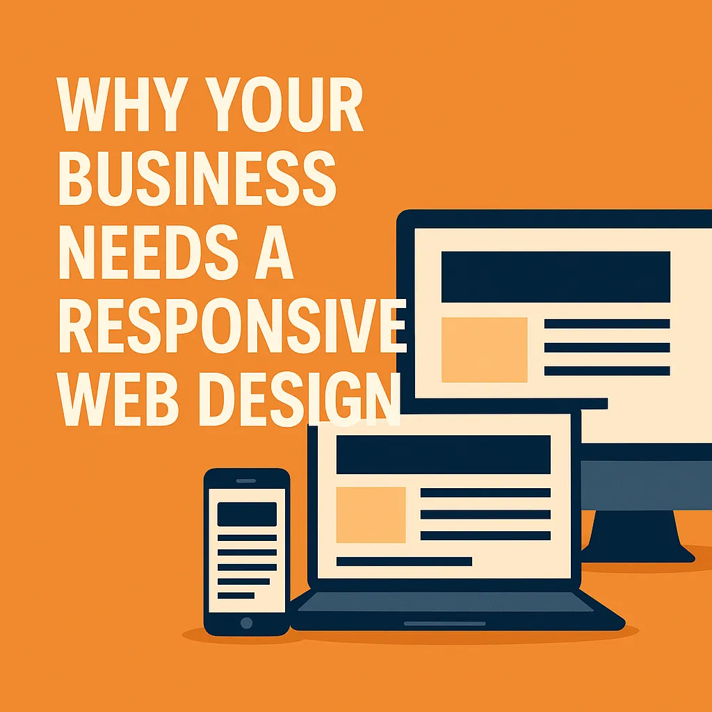
Why Your Business Needs a Responsive Web Design
Did you know that more than 59% of global web traffic now comes from mobile devices? In a digital-first world where customers switch seamlessly between phones, tablets, and desktops, your website must keep up. Yet, countless businesses still rely on static, outdated sites that don’t adapt to evolving screen sizes and user behaviors.
In today's hyper-competitive digital landscape, your website isn't just a digital business card—it’s your storefront, customer engagement hub, and sales engine. Without responsive web design, you're leaving money—and customer satisfaction—on the table.
This comprehensive guide will walk you through everything you need to know about responsive web design: what it is, why it’s essential to your business success, how to implement it effectively, and how to avoid common pitfalls.
What Is Responsive Web Design?
Responsive web design ensures your website content automatically adjusts and displays effectively on all screen sizes—from large desktop monitors to smartphones.
Key principles include:
Fluid grid layouts that proportionally scale content
Flexible images that resize within containers
CSS media queries that apply different styles based on screen dimensions
Unlike separate mobile sites, responsive design uses a single codebase, maintaining consistency and reducing maintenance costs.
A Brief History of Responsive Design
The term Responsive Web Design was first coined in 2010 by Ethan Marcotte. As mobile usage surged, developers needed a way to improve multi-device experiences without duplicating work across platforms. Responsive design quickly evolved into a must-have rather than a trends.
Why Responsive Design Matters
1. Improved User Experience
A responsive website offers:
Seamless navigation
Faster load times
Touch-friendly interfaces
🧠 57% of users won’t recommend a business with a poorly designed mobile site.
2. Increased Reach and Accessibility
Responsive design makes your content accessible on:
Phones, tablets, laptops, desktops
Smart TVs and wearable devices
Assistive technologies for differently-abled users
3. Better SEO Performance
Google favors responsive sites due to mobile-first indexing. Benefits include:
Single URL for all devices
Faster page speed
Reduced duplicate content
🚀 Learn more in our guide on how to optimize your website for search engines.
4. Higher Conversion Rates
Mobile-optimized websites can see up to a 64% increase in conversions. Responsive design:
Reduces bounce rates
Encourages goal completions (form fills, purchases, etc.)
5. Cost Efficiency and Future-Proofing
With responsive design:
Manage a single codebase
Adapt to new tech (e.g., foldables, voice search)
Reduce long-term development costs
Explore more in our article on how to maximize your website's performance.
Key Features of Responsive Web Design
Responsive Images
Use:
srcsetfor loading appropriate image sizesCSS media queries for conditional formatting
Fast Load Times
Boost performance with:
Image compression
JS/CSS minification
CDN services like Cloudflare
📊 A 1-second delay in load time = 20% fewer conversions.
Discover why website speed matters and how to improve it.
Best Practices for Responsive Web Design (2025)
Design mobile-first, scale up later
Use structured heading tags (H1-H6)
Maintain consistent branding
Optimize and compress media
Test frequently on real devices and tools like Google’s Mobile-Friendly Test
Read more in our article on website speed optimization services.
How to Implement Responsive Design
1. Audit Your Existing Website
Use tools like:
Google Search Console (mobile usability report)
Google Analytics (device traffic reports)
BrowserStack for cross-device testing
2. Choose the Right Platform
Use platforms that support responsive design, such as:
Go HighLevel (GHL) for websites, landing pages, and CRM
Cloudflare for CDN integration
Namecheap for domain registration
Explore CMS tools built for scalable growth
3. Plan with Project Management Tools
Tools like Notion or ClickUp help manage tasks, templates, and timelines efficiently.
4. Prioritize Mobile-First Design
Start development with mobile layouts
Ensure buttons are thumb-friendly
Avoid hover-based interactions
5. Use Google’s Ecosystem
Submit a mobile-optimized sitemap in Google Search Console
Track bounce rates on mobile via Google Analytics
Create a complete Google Business Profile
Common Responsive Design Mistakes to Avoid
Designing for desktop first
Using large, unoptimized images
Failing to test on multiple devices
Poor touchscreen usability
Tight spacing and unreadable fonts
Getting Started: Practical Steps
✅ Secure your domain with Namecheap
✅ Use GHL for building responsive sites
✅ Design flexible wireframes
✅ Use media queries and percentage widths
✅ Test using real devices and Google’s Mobile-Friendly Test
Frequently Asked Questions
Q: What’s the difference between responsive and adaptive design?
A: Responsive design automatically adjusts layout via CSS media queries. Adaptive design uses pre-set layouts for specific screen sizes. Responsive is more scalable and flexible.
Q: Does responsive design affect SEO?
A: Absolutely. Responsive sites support Google’s mobile-first indexing, improve crawlability, reduce bounce rates, and support stronger URL structures—all leading to better rankings.
Final Thoughts
Your customers expect a smooth, seamless web experience—on any device. Responsive web design is no longer optional—it’s essential for growth, conversions, and staying competitive in the modern marketplace.
